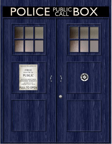
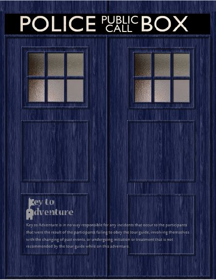
Description: A brochure advertising a trip into the Tardis advertised by a fictional company call Key to Adventure.
Process (Programs, Tools, Skills): I began my brochure with a perusal of images. I looked for large images and sought inspiration for my design. I then put together a design on InDesign inserting my images. I also make a logo on Illustrator. I printed a few times in color and black and white to be sure that it would fold correctly and looked well with the design. I then printed the final print and folded crisply.
Message: The message is to come on this trip.
Audience: The message is to young adults and adults who have loved the Doctor Who television show.
Top Thing Learned: Sometimes you have to settle.
Color scheme and color names: Monochromatic blue.
Title Font Name & Category: Nueva Std, Modern
Copy Font Name & Category: Sakkal Majalla, Sans Serif
Word Count of copy: 290
Thumbnails of Images used:
Sources (Links to images on original websites)
http://blogtorwho.blogspot.com/2013/07/official-tardis-studio-tours.html
https://www.pinterest.com/elfaga/tardis-door/
http://imgkid.com/sonic-screwdriver-11th-doctor-tattoo.shtml
https://wallwidehd.com/doctor-who-season-8-poster-wallpaper/
Video


Well done on the assignment! The front police box image is very clear and appealing to they eye. I also like how you repeated that image on the front and back. The inside design is pretty simple but intricate at the same time; the curved lines make for a very appealing and interesting visual. I like the idea for the logo, but it appears a little pixilated. But overall, nicely done!
Check out Sarah’s post at https://sarahembrycomm130.wordpress.com/2015/03/27/p8-brochure/
LikeLike
Courtney, this is a beautiful flier. The bold colors and eccentric style are most appealing. Your design elements create a repetition that feels classy. Check out Alisha’s brochure about Islam, she did a great job too!
https://alishacbecker.wordpress.com/
LikeLike