
- Portfolio (Scribd.com): Created on InDesign and transferred to Scribd to be viewed here.
- Project Corrections / Time spent: 2 hours
- Message: A display of my abilities gained while in this class
- Audience: Employers
- Top Thing Learned: Procrastination is not a friend.
- Future application of Visual Media: I hope to use it to supplement my employment and for my books.
- Color scheme and color names: Monochromatic black and white
- Title Font Name & Category: Alegrian, Modern
- Copy Font Name & Category: Canadra, Oldstyle
- Thumbnails of Images used:


- Sources (Links to images on original websites / with title of site): http://blogtorwho.blogspot.com/2013/07/official-tardis-studio-tours.html
https://www.pinterest.com/elfaga/tardis-door/
http://imgkid.com/sonic-screwdriver-11th-doctor-tattoo.shtml
https://wallwidehd.com/doctor-who-season-8-poster-wallpaper/
Hymnbook -Babbings and more.com –http://www.babblingsandmore.com/2011/10/temple-picture-with-homemade-mod-podge.html
Singing Girl – Mormonnewsroom.org – http://www.mormonnewsroom.org/article/what-to-expect-at-church-services
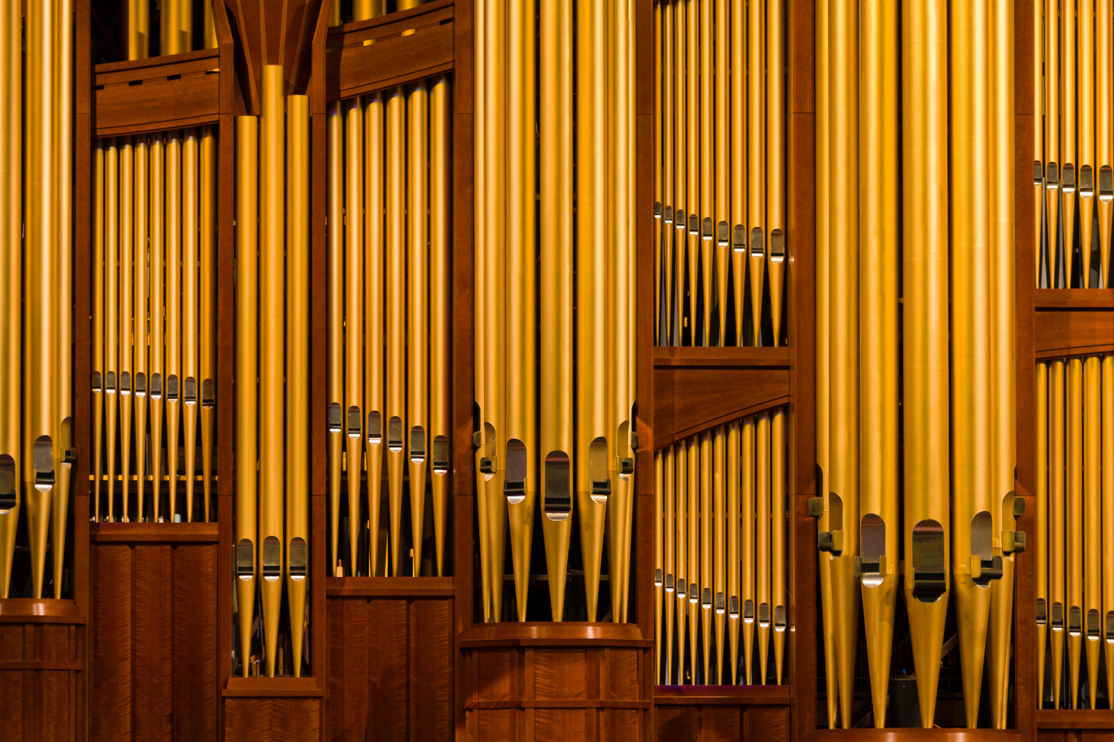
Organ – lds.ord – http://media.ldscdn.org/images/media-library/conference-events/general-conference/conference-center-organ-pipes-925355-print.jpg
Rock – CG Textures – http://www.cgtextures.com/texview.php?id=53686&PHPSESSID=4fk30gocflidq5plgqnte8e837
https://byui.brainhoney.com/Frame/Component/CoursePlayer?enrollmentid=25933616&itemid=C7OID
Vancouver wild: a Photographer’s journey through the southern Coast Mountains, 10inx10in, HP Laser Jet Enterprise MFP M725, First floor McKay Library


I thought that your choice of black, white, and gray for the background of your portfolio was really nice, because it helped to draw attention to the color in your projects. I also love how the designs on the edges of your page are symmetrical. They look really cool. My only concern is that the design sometimes cuts into the titles on your pages, and hurts the legibility somewhat. Other than that, you did a really good job.
LikeLike
If you want to see my portfolio, you can find it here: https://camcommportfolio.wordpress.com/2015/04/04/project-9-portfolio-2/
LikeLike
Courtney! I really like your design. I like your design. It looks good and helps your projects stand out . I really like how you used the repetition of the triangle. check out camille’s portfolio at https://camcommportfolio.wordpress.com/category/visual-media-design-2015/
LikeLike