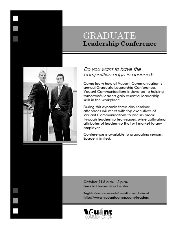
Description: This flier is a description and information for a leadership conference. The flier, which is kept in the grey scale, demonstrates contrast and simple form to clearly display it’s message and information.
Process (Programs, Tools, Skills): I started by evaluating the needs of this project and sketching out drafts that met those needs. After some thought, I proceeded to input the best draft into Adobe InDesign. I shifted elements around and tested several objects, various shades, and different typography to compose a design that exemplified the message. I then sought the opinions of others who provided critique that aided me in improving the design. I added multiple elements and moved a number of other elements before deciding that the project had reached completion. From there, I printed it out and posted it.
Message: The message is that the conference will better a graduate’s skills and help them be hired into quality employment if the attend the conference.
Audience: The audience is graduates interested in improving their leadership skills.
Top Thing Learned: I learned to double check the work and especially the font to be sure that it is exactly as it is expected to be.
Title Font Name & Category: The title font is Century Schoolbook which is from the Modern category.
Copy Font Name & Category: The copy font is Century Gothic which is from the Sans Serif category.
Links to images used in this project: https://byui.brainhoney.com/Frame/Component/CoursePlayer?enrollmentid=25933616&itemid=C7OID


Courtney! Your flier has some great design elements. I really like how you overlapped the picture. It gives the design a nice feel. You also have a good use of repetition throughout the piece by using the squares. I think it was a good idea to put the TDP and the website in the gray box to make them stand out more. If you want to see another great flier you should check out Jodi’s. Here is her blog: https://runlittlejo.wordpress.com/2015/01/23/project-1-flier/comment-page-1/#comment-2 .
LikeLike
Love the squares. I think the hardest part for me was having a theme that extended throughout, and you managed that perfectly. I like the serious vibe that your flyer gives off. The gray boxes help to keep the entire flyer well balanced and even. Annie Wilcock had a really good flyer with impressive elements (I thought) https://annjeaphotography.wordpress.com/2015/01/24/project-1-flier/comment-page-1/#comment-1
LikeLike