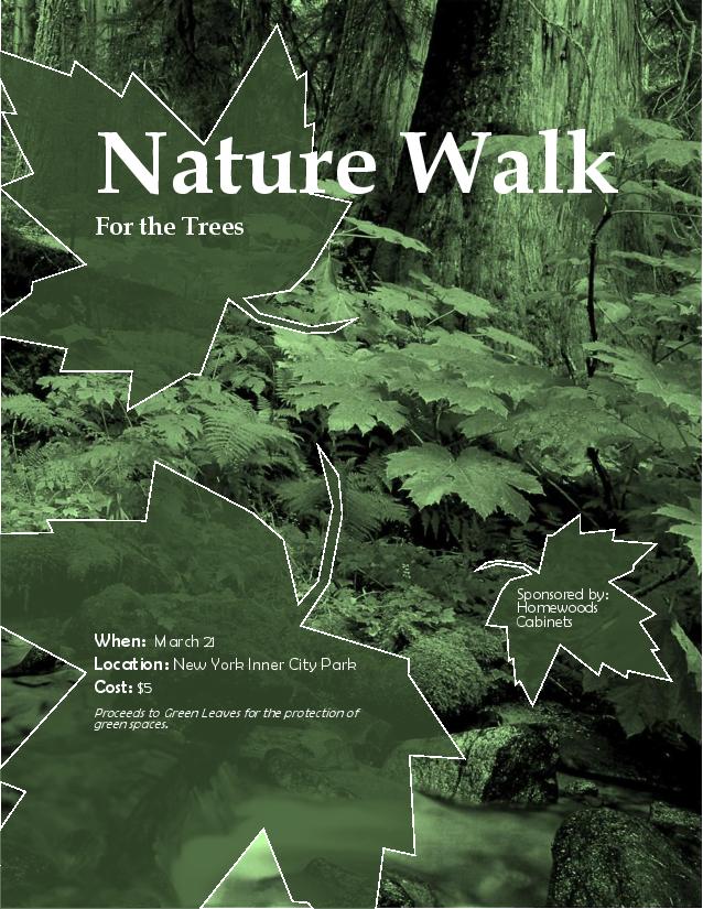
Description: This event ad details a charity activity in monochromatic green coloring.
Process (Programs, Tools, Skills, FOCUS principles): I began with drafts into which I worked various design principles. I then found a suitable photograph that worked well with the event that I had in mind. I chose to use Microsoft Word as an assessable program to create this event ad. Setting the photo in the design I had chosen from the drafts, I began to incorporate text and information into the ad. I then used a color filter to change the photo into a monochromatic set up and worked with the contrast and brightness until I found a pleasing setting. I used the freeform tool to create the text backdrop leaf symbols to which I added color and transparency. After placing the text into the leaves and some modifying, I sought the advice of a few others. This lead me to a number of changes that improved the ad, such as the title enlargement, certain text alignments, and a slight color change to the leaf backdrops.
Message: The message is that if they come to this event they’ll help preserve nature.
Audience: This event add is directed at those who appreciate nature.
Color scheme and color names: Monochromatic Green
Top Thing Learned: I learned that the advice of others will quickly bring about a better and more effective design.
Title Font Name & Category: Book antiqua, Oldstyle
Copy Font Name & Category: Berlin Sans FB, Slab Serif
Scanned images used, sources, original sizes, location of scanner used: Vancouver wild: a Photographer’s journey through the southern Coast Mountains, 10inx10in, HP Laser Jet Enterprise MFP M725, First floor McKay Library

