Project 9 Portfolio


Posted in Uncategorized | 3 Comments

P8 Brochure

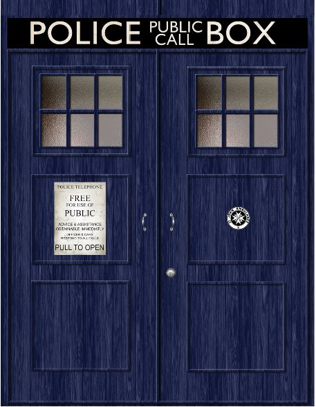
P8 Courtney Eutsler Front

P8 Courtney Eutsler Inside

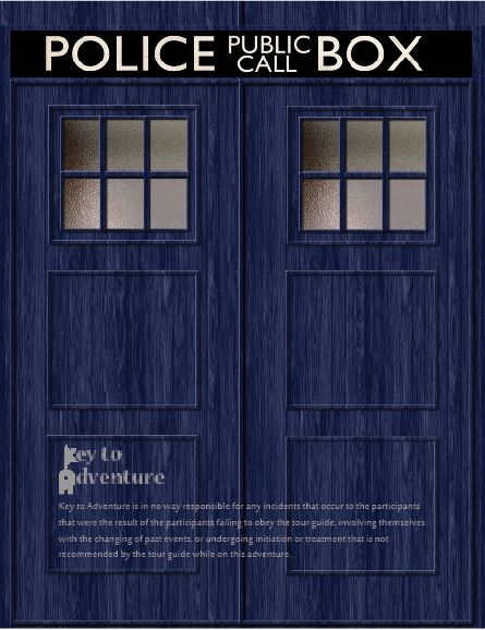
P8 Courtney Eutsler Back


Description: A brochure advertising a trip into the Tardis advertised by a fictional company call Key to Adventure.

Process (Programs, Tools, Skills): I began my brochure with a perusal of images. I looked for large images and sought inspiration for my design. I then put together a design on InDesign inserting my images. I also make a logo on Illustrator. I printed a few times in color and black and white to be sure that it would fold correctly and looked well with the design. I then printed the final print and folded crisply.

Message: The message is to come on this trip.

Audience: The message is to young adults and adults who have loved the Doctor Who television show.

Top Thing Learned: Sometimes you have to settle.

Color scheme and color names: Monochromatic blue.

Title Font Name & Category: Nueva Std, Modern

Copy Font Name & Category: Sakkal Majalla, Sans Serif

Word Count of copy: 290

Thumbnails of Images used:

Tardis Console Tardis Doors Tardis in Space the doctors 11th's screwdriver Tardis Doors back


Sources (Links to images on original websites)

http://blogtorwho.blogspot.com/2013/07/official-tardis-studio-tours.html

https://www.pinterest.com/elfaga/tardis-door/

http://www.wallpedes.com/awesome-tardis-wallpaper/amusing-tardis-drifting-in-open-space-wallpaper.html

http://imgkid.com/sonic-screwdriver-11th-doctor-tattoo.shtml

https://wallwidehd.com/doctor-who-season-8-poster-wallpaper/


Video

Posted in Uncategorized | 2 Comments

P7 – Html and Css

P7CourtneyEutsler


Description: This web page is designed to tell about the Candle Emporium logo.

Process (Programs, Tools, Skills): I used Notepad ++ to edit the html file so that it would have all the elements and words I needed. I then edited the css document to include the colors that matched my logo design. I also separated heading 6 from the rest of the heading designs. To heading 6 I added a background with rounded corners so I could mirror the top of the document to the bottom of it. I received critique and adjusted the design accordingly.

Message: The message is to inform people about the logo of Candle Emporium.

Audience: Young adults with an interest in candles.

Top Thing Learned: I learned that html and css are easier to understand than I think I does.

Color scheme and color hex(s): Brick F1A874, Purple BF84B8, Pink EB8787, Deep Purple 240523

Title Font Families & Category: Berlin Sans FB, Sansserif

Copy Font Families & Category: Bell MT, Oldstyle

Changes made to the CSS: I adjusted the spacing and added a background with curved edges to a heading.

Word Count: 254

Posted in Uncategorized | 2 Comments

P6 – Stationery

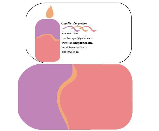
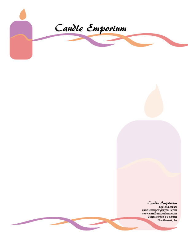
P6CourtneyEutsler Stationery


Description: This is a set of business cards and stationary for the company Candles Emporium.

Process (Programs, Tools, Skills): I drafted the designs to match each other and the message of the cards. I designed the logo and images on Illustrator. I then placed the images in InDesign. I arranged the stationery to suit the company. I finished designing the business cards in Illustrator. I needed to go back and modify the images and stationery after critique. Once the designs were sufficient, I posted it.

Message: It is cool and calming to have a candle.

Audience: It is intend as an invitation to young adults to come purchase candles.

Top Thing Learned: I learned not to forget important details.

Color scheme and color names: I used the analogous scheme with the colors purple, red and brick.

Title Font Name & Category: AR Berkley, decorative

Copy Font Name & Category: Bell MT, old style

Posted in Uncategorized | 3 Comments

P5 – Logos

CourtneyEutsler-P5Logos


Description: Three logo designs for an outdoors recreational company.

Process (Programs, Tools, Skills): I first researched the types of recreation companies and the types of logos they use. Then I drafted my own and began inputting and designing them into Adobe Illustrator. When I had fitted in text and elements stylistically, I took the logos to be critiqued. I followed the advice and improved each of the logos. I continue working with them to sharpen the message. I then printed the logos and had people rate them.

Message: The message is that the company is exciting and fun.

Audience: The audience is directed to outdoors individuals with a love for an adrenaline rush.

Top Thing Learned: I’ve learned to give myself more time and focus to these design.

Three Color Scheme and Color Names:

Top Logo: Complementary – red and green

Middle Logo: Split Complementary – indigo, yellow, and orange

Bottom Logo: Monochromatic – red

Three sets of Title / Body Font Names & Categories: For all three designs I used AR Berkley, script, and AR Julian, slab serif.

Votes on favorite logo:

Top Logo = _4_; Middle Logo = _7_; Bottom Logo = _10_;

My favorite logo is the top logo.

Posted in Design | Leave a comment

P4 – Montage

CourtneyEutsler-P4Montage-Train

Description: This is a spiritual piece with several combined pictures to form a smooth montage.

Process (Programs, Tools, Skills, Steps taken while designing): I worked upon a draft idea and went to search for pictures to match my message. After I found high quality images I brought them into a work space on Photoshop. I carefully masked in each layer. I added a filter layer to the girl and overlay effect to some of the layers in order to create a good effect. I added text modifying the font and color to make it more attractive. I then played with the elements after critique to create a good montage.

Message: It is an invitation to sing when you feel happy.

Audience: The invitation is open to everyone though is bent to appeal to those with an appreciation for music.

Top Thing Learned: I learned that asking the right questions to the right people gets me ahead.

Filter / Colorization used and where it was applied: I applied the filter rough pastels to the lower portion of the girl with her hymnbook.

Color scheme and color names: Complementary – teal and brick

Title Font Name & Category: Tempus Sans ITC sans serif

Copy Font Name & Category: Tempus Sans ITC sans serif

Thumbnails of Images used:

Singing-in-Church mormon news room

lds.org pipe organ

hymn book babbling and more

BrickOldRounded0134_1_M

Sources (Links to images on original websites / with title of site):

Hymnbook -Babbings and more.com – http://www.babblingsandmore.com/2011/10/temple-picture-with-homemade-mod-podge.html

Singing Girl – Mormonnewsroom.org – http://www.mormonnewsroom.org/article/what-to-expect-at-church-services

Organ – lds.ord – http://media.ldscdn.org/images/media-library/conference-events/general-conference/conference-center-organ-pipes-925355-print.jpg

Rock – CG Textures – http://www.cgtextures.com/texview.php?id=53686&PHPSESSID=4fk30gocflidq5plgqnte8e837


Posted in Uncategorized | 1 Comment

P3 – Photography

P3CourtneyEutslerDescription: This design is a touched up photograph with type and color elements.

Process (Programs, Tools, Skills, FOCUS principles): After a photo session with my digital camera, I selected a photograph that followed an asymmetric style with interest and a color scheme I could use. I brought the photo into Photoshop where I adjusted the light levels, vibrancy/saturation, colors and sharpness. I reevaluated my colors and shifted some of the colors to match the color scheme. I tried a few designs and with the help of many critiques, selected one that would work. I added bubbles of color which I texturized to match the photo’s style. I then added text to illustrate the message best.

Message: The message is that every decoration and element has a place.

Audience: The audience is directed to those who are decorating their homes.

Top Thing Learned: I learned to mind my proof and be very careful with it.

Color scheme and color names: Split complementary – gold, purple, lime

Title Font Name & Category: Tempus Sans ITC

Copy Font Name & Category: Tempus Sans ITC

Thumbnail of original, unedited image inserted

IMG_0205

Date and location you took the photo(s) February 3, 2015 Ivy Lobby

Posted in Uncategorized | 3 Comments

Activity 3 – Photography

Light 1 - Oustide

Light 1 – Oustide

Light 2 - Inside

Light 2 – Inside

Focus 1 - Foreground

Focus 1 – Foreground

Focus 2 - Background

Focus 2 – Background

Composition 1 Thirds

Composition 1 Thirds

Composition 2 - Thirds

Composition 2 – Thirds

I followed my usual photo taking endeavors. I searched for interesting subjects making sure they matched the criteria. Then I took a number of photos. I then selected the ones that would work best.

I brought each of the photographs into Photoshop. I then put them through the level, vibrance, color selection, and sharpening tools until they looked good. Two photographs needed straightening. Then I posted them here.

Posted in Design | Leave a comment

P2 – Event Ad

P2CourtneyEutsler

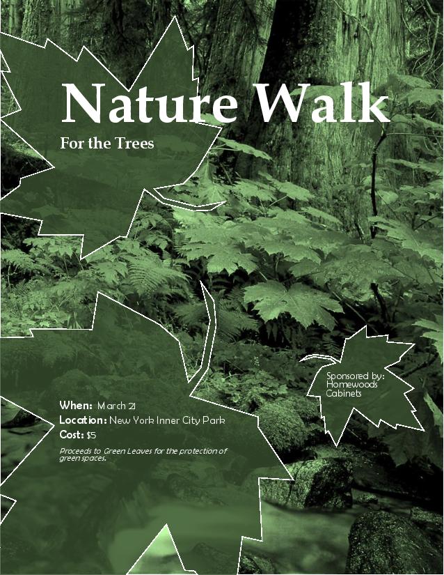
Description: This event ad details a charity activity in monochromatic green coloring.

Process (Programs, Tools, Skills, FOCUS principles): I began with drafts into which I worked various design principles. I then found a suitable photograph that worked well with the event that I had in mind. I chose to use Microsoft Word as an assessable program to create this event ad. Setting the photo in the design I had chosen from the drafts, I began to incorporate text and information into the ad. I then used a color filter to change the photo into a monochromatic set up and worked with the contrast and brightness until I found a pleasing setting. I used the freeform tool to create the text backdrop leaf symbols to which I added color and transparency. After placing the text into the leaves and some modifying, I sought the advice of a few others. This lead me to a number of changes that improved the ad, such as the title enlargement, certain text alignments, and a slight color change to the leaf backdrops.

Message: The message is that if they come to this event they’ll help preserve nature.

Audience: This event add is directed at those who appreciate nature.

Color scheme and color names: Monochromatic Green

Top Thing Learned: I learned that the advice of others will quickly bring about a better and more effective design.

Title Font Name & Category: Book antiqua, Oldstyle

Copy Font Name & Category: Berlin Sans FB, Slab Serif

Scanned images used, sources, original sizes, location of scanner used: Vancouver wild: a Photographer’s journey through the southern Coast Mountains, 10inx10in, HP Laser Jet Enterprise MFP M725, First floor McKay Library

Posted in Design | Leave a comment

P1-Flier

CourtneyEutslerInDesignFlier

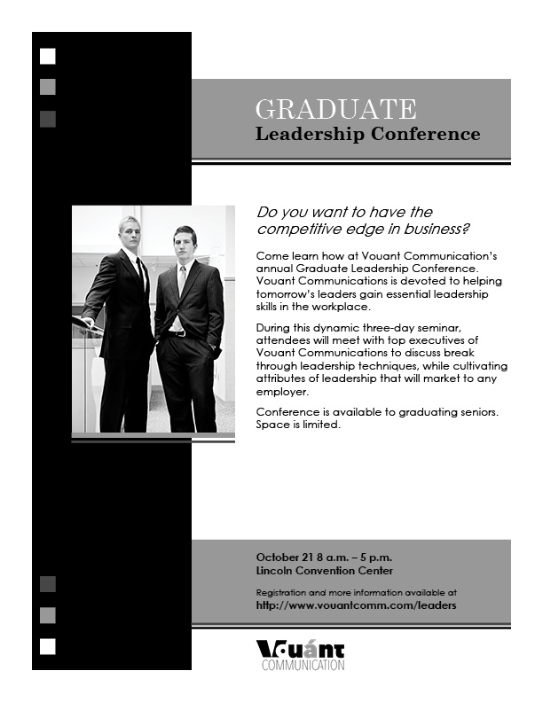
Description: This flier is a description and information for a leadership conference. The flier,  which is kept in the grey scale, demonstrates contrast and simple form to clearly display it’s message and information.

Process (Programs, Tools, Skills): I started by evaluating the needs of this project and sketching out drafts that met those needs. After some thought, I proceeded to input the best draft into Adobe InDesign. I shifted elements around and tested several objects, various shades, and different typography to compose a design that exemplified the message. I then sought the opinions of others who provided critique that aided me in improving the design. I added multiple elements and moved a number of other elements before deciding that the project had reached completion. From there, I printed it out and posted it.

Message: The message is that the conference will better a graduate’s skills and help them be hired into quality employment if the attend the conference.

Audience: The audience is graduates interested in improving their leadership skills.

Top Thing Learned: I learned to double check the work and especially the font to be sure that it is exactly as it is expected to be.

Title Font Name & Category: The title font is Century Schoolbook which is from the Modern category.

Copy Font Name & Category: The copy font is Century Gothic which is from the Sans Serif category.

Links to images used in this project: https://byui.brainhoney.com/Frame/Component/CoursePlayer?enrollmentid=25933616&itemid=C7OID


Posted in Design | 2 Comments